Design System for
Enterprize Application
Enterprise design system for legal firm
Key highlights of this project
“Design Systems is not just about components, but about
strategy, governance, scalability, and cross-functional alignment”

Overview
Role & Duration
Aderant is a global leader specializing in business management software solutions for law firms and other professional services organizations.
Key Features:
Practice Management: Streamlining daily operations, managing cases and matters, time and expense tracking, billing and e-billing, and integrating outside counsel guidelines (OCGs) to improve efficiency and profit.
Financial Management:
Handling global accounting, financial reporting, and compliance, including trust accounting.
Business Intelligence:
Providing tools and dashboards to analyze financial performance, identify areas for improvement, and make informed business decisions.Other Solutions: Offering modules for client management (CRM), knowledge management, timekeeping, compliance, docketing, calendaring, and legal case management.
-
Principal Designer / UX Lead, led creation and rollout of a scalable, component-driven design system that could work across multiple product lines and tech stacks.
-
Defined architecture, taxonomy, naming conventions
-
Built the contribution model and governance framework
-
Drove adoption across design, dev, QA, and PM teams
-
Partnered with frontend leads to sync Figma with code (Storybook/Angular/React)
Duration
11 Months
Team Size
10+
Team
UX Designer, Product Manager, Fullstack Developer, Backend Developer, QA, Scrum Master, Engineering Architect
Client
Project Summary
Problem Statement
“How might we unify the UX language across products and accelerate development while improving accessibility, usability, and brand coherence?”
Success Criteria
Built Design System for:
-
Product Type: Multi-tenant enterprise platform
-
Design Team: 10+ distributed designers
-
Engineering Teams: 100+ product teams,
-
Tech Stacks: 3
Pain Points
-
Fragmented visual language and inconsistent UI patterns
-
Delays in dev–design handoff
-
Accessibility issues (e.g., inconsistent ARIA usage)
-
Designers creating redundant components in silos
Challenges
-
Customised requirements for individual products
-
Multiple technology stacks for development
-
Geographically divided design and engineering team working in silos
-
Attrition in design and engineering teams
-
Unavailability of a single source (guidelines) of truth for using the design assets
-
Inconsistency in implementation due to manual component creation by the engineering team
Outcome

Vision & Goals
Vision & Strategy
Design Systems at Scale
-
Drive efficiency: Reduce design & dev time by reusing components.
-
Ensure consistency: Unified look, feel, and interaction across products.
-
Build accessibility in from the start leads to compliance & inclusivity.
Enabling Multi-Product Platforms & Teams
-
A shared foundation that scales across products, geographies, and channels.
-
Empowers cross-functional teams (design, dev, product) to speak the same language.
-
Reduces duplication, enabling faster onboarding for new teams.
Alignment with Business Priorities
-
Faster time-to-market leads to accelerated product releases.
-
Brand cohesion leads to stronger customer trust and recognition.
-
Operational savings leads to less rework, fewer defects, lower maintenance cost.
Goals of Design System
-
Consistency:
Ensure a unified visual and interaction language across products. -
Efficiency:
Speed up design and development by reducing redundant work. -
Scalability:
Make it easier to expand products and features without reinventing components. -
Accessibility & Inclusivity:
Build accessibility into the foundation of design and code. -
Collaboration:
Create a shared language between design, development, and product. -
Quality:
Improve product reliability and reduce UI/UX bugs. -
Brand Alignment:
Ensure the digital experience reflects the company’s brand identity.
Approach
1. Audit & Analysis
-
Inventory of all components (across products)
-
Identified top-used patterns and redundancies
-
Benchmarked accessibility and brand compliance
2. Foundation & Structure
-
Defined tokens: colors, typography, spacing, elevation
-
Created modular components (buttons, inputs, tables, modals)
-
Built pattern libraries: page templates, form flows, dashboards
3. Governance & Contribution
-
Built a component request and approval process
-
Defined versioning and deprecation guidelines
-
Established core team + satellite contributors per product line
4. Adoption & Evangelism
-
Workshops with design + dev teams
-
Created onboarding guides, Figma kits, and developer docs
-
Paired with engineering to ensure component parity
Requirement Gathering
CSD (Certainties, Suppositions, Doubts)
During the requirement gathering phase, we aligned the team on objectives, commitments, resources, and risks.
We then used the CSD (Certainties, Suppositions, Doubts) Matrix to enhance planning and decision-making, leading to the confirmation of the following points:
-
Leveraging MUI as a base to create Design system
-
Documenting the design system in Supernova
-
Demonstrate the components' functionality in Storybook
-
Aderant’s brand identity in DS
-
Documenting each component with its use cases
-
Using Atomic Design methodology

Automic Design System
Aderant’s Design system is based on Brad Frost’s Design approach popularly known as “Atomic Design Mehtodology”.
Atoms:
Basic building blocks
Molecules:
Combination of atoms
Organisms:
Complex molecules made of molecules
Templates:
Layout & Structure
Pages:
Specific instances of templates


Process

Setup
Material UI is an open-source React component library that implements Google's Material Design. It's comprehensive and can be used in production out of the box.
We then duplicated the file to serve as the primary design system file for Aderant, while keeping the original as a backup for future reference.
To access the source MUI components and library, the paid version of Figma MUI v5.16.0 was purchased and imported into Aderant’s environment.

Establish Foundations & Design Principles
After understanding the product vision, we reviewed the brand guidelines and UI principles to grasp the company's core values. Based on this, we defined the typography, colors, grids, spacing, and elevations.
Brand Guidelines
To define typography, we reviewed the existing product components to understand fonts, weights, and properties like line height and letter spacing. Based on this, we created a type scale to suit Aderant's products.

Colours
We reviewed the brand colors and decided to keep the semantic and neutral colors consistent across all products, while adapting the product-specific brand colors to maintain unique identities.

We then defined color palettes, ensured accessibility compliance, and defined color tokens for consistency.
Grid & Breakpoints, Spacing and Elevations

Define Design Tokens
Design tokens are used to store resuable values and are key to keeping our designs consistent, scalable, and efficient.
For Aderant, we’ve organized tokens into different categories: primitive tokens (like colors), semantic tokens (representing meanings like "primary-hover color"), and component tokens (specific to elements like buttons or chips). We also have tokens for other design properties like grids, shapes, elevation, and spacing, making it easier to apply and update design values across the system.
We also have tokens for other design properties like grids, shapes, elevation, and spacing, making it easier to apply and update design values across the system.

Property Tokens
We created property tokens for typography, then used these tokens to build the typography variables.
Finally, we applied these tokens to define the text styles used throughout the file.

Define Iconography
Iconography provides instant visual communication in design. Aderant was previously using the Fontastic icon library, but we reorganized its icons into categories and added five different states (filled, outlined, rounded, two-toned, and sharp) based on MUI standards.
However, Fontastic had limitations with these variations, so after careful review, we updated the library to use Material Icons, with just two variants: filled and outlined. Additionally, we created an icon component that can be used across the file for scalable icons and inverted state.

Creating & Updating Existing MUI Components
The components are grouped into categories like Inputs, Data Display, Feedback, Surfaces, MUI X, Layout, Pre-built, and Navigation.
The 'Parking Lot' category includes MUI components that aren't needed in Aderant right now but may be used later.

Component Customization Process


Documentation & Guidelines
Each component has its own documentation, which includes examples, details about the component and its properties, customization tips, and any specific usage guidelines.

Testing & Validating Each Component
After customizing a component, showcase it to the client for review, add comments if needed, and then update the "Components Completion Process Checklist" with the status set to "Done." This checklist tracks the progress of each component’s customization, with different stages that are updated as work progresses.
Each component has its own checklist on its respective page, ensuring clear tracking of the entire process.

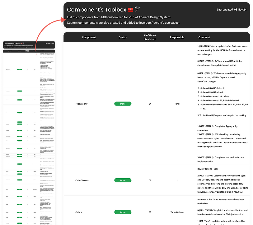
Tracking the Progress & Changes
While customizing each section, there are instances where we need to revise certain components multiple times due to changing requirements or use cases. To make these changes easier to track and identify which sections are frequently updated, we created a "Component’s Toolbox" as a progress tracker.
Creating Pre-builts components
Once all components customization is completed, the next step is to create pre-built components/templates.
These can be either created by:
-
Customizing existing components.
-
customising & combining existing components to create a template.


Publishing Design System
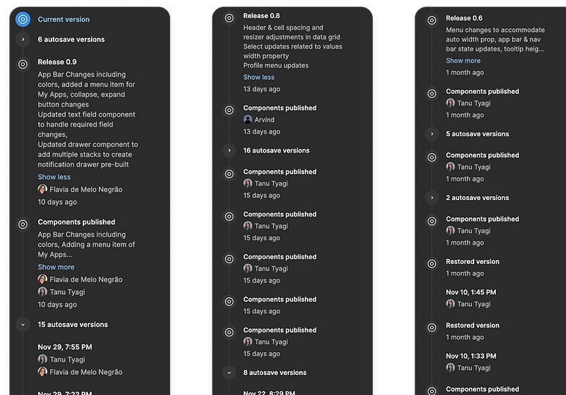
After the design system was approved for use in products, we set up version control with weekly publishing, using semantic versioning for better maintenance. Each release highlighted the major changes made in the design system.
We publish updates every Monday, and clients have already been notified about this on a separate Slack channel. Additionally, a few auto-saved versions of components were published separately from the regular library updates. This was done to immediately reflect changes made to certain components that the client needed to use right away.
Handoff Documentation
For the handoff part, we created several artifacts which would help clients in educating the team about design system, updating & maintaining the design system.
-
Change Log
-
Design Best Practices
-
Video Documentation for complex components
-
Step-by-step guide to create/update video documentation

Results
As the client starts using the new Design System, we've seen some early results that show its impact on workflows, consistency, and collaboration.
These initial outcomes can later be turned into measurable metrics to track the system's long-term effectiveness. Here are the key outcomes:
Higher adoption among teams to ensure consistency across products
Increased UI consistencies
Faster time to market with reusable components
System component usage >> customised components usage
Scalable components to fit different products’ requirements
Reduced training costs with clear documentation
Better collaboration between various teams
Quality control with fewer design inconsistencies
Easy maintenance with centralised update across products


Outcome/Impact

Governance, Versioning, and Communication
Version Control
Use semantic versioning (e.g., v2.1.0) so teams know if it’s a patch, enhancement, or breaking change.
Change Management Process
-
Propose → Review → Approve → Document → Release.
-
Involve design + dev + product stakeholders to avoid surprises.
Deprecation Strategy
-
Mark old components as deprecated before removal.
-
Give teams migration guides and timelines.
Testing Across Products
Automated regression testing + visual snapshots (e.g., Percy, Chromatic) to detect unexpected changes.
Communication
Release notes, changelogs, and design system office hours to align cross-functional teams.
Design for Flexibility and Donsistency
Define Core + Extensible Properties
Core (fixed): accessibility, spacing rules, typography scale, color contrast.
Extensible (flexible): variants, states, theming, layout options.
Use Variants & Tokens
Example: a Button with size (sm, md, lg), type (primary, secondary, ghost), and state (default, hover, disabled).
Controlled flexibility avoids chaos while meeting diverse needs.
Guardrails, not Hard Walls:
Provide guidelines for when and how to extend.
Allow controlled overrides through tokens or utilities.
Real-World Testing
Test components in multiple product contexts before finalizing.
Challenges
-
Acknowledging WCAG & Color accessibility guidelines.
-
Getting actual user Data/feedback
-
Browser compatibility with components
-
Visualisation of stand alone components
Future Roadmap
-
If time permits, include a short forward-looking slide:
-
Integration with AI-guided UI suggestions
-
Self-service pattern request workflows
-
Accessibility automation
Other Wins
-
Components integrated into CI/CD pipelines
-
Enabled faster onboarding of new designers and developers
-
Set foundation for theming and future white-label support
Reflections/Lessons
-
Early buy-in from engineering leadership was critical
-
Documentation and ongoing support made adoption sustainable
-
Flexibility (design principles > rigid templates) helped teams adapt the system without resistance
-
Learned to treat the system like a product—with roadmap, backlog, feedback loop