


Overview
Role & Responsibilities
Joystik offers a mind-body medicine technique that is more engaging, simpler, and powerful than what is already available. Its unique solution uses an evidence-based technique and enhances it to provide more value in your life and give users a powerful, on-demand tool.
Joystic wants to help users realize the control they have over their stress response. It teaches you the tools you need to be your own “controller,” enabling users to connect and harness the power of their mind and body.
Joystik wants to come up with wellness app which acts like a mind body assistant for users in a way that helps them to relax, de-stress improve focus, sleep, etc. by sending relaxation responses to the brain.
Product Designer
User Research, Interaction, Visual design, Prototyping & Testing
Team
UX Designer, Product Manager, React Developer, Fullstack Developer, Backend Developer, QA, Scrum Master, Engineering Architect
Client
Joystik

Project Summary
Business Objective
Create a mobile application for mental wellbeing by using therapeutic tools used in mind-body workspace.
Subscription-based services for monetization.
Success Criteria
-
Test prototypes with users of the application
-
Develop hybrid app for both iOS and Android users
Use Goals
The user undergoes the treatment for mental wellbeing by taking a series of tasks
Challenges
-
Understand the domain
-
Testing of application with stakeholders
-
Prioritisation based on stakeholder changing needs
-
Usability testing
Outcome
Successful beta release of the application
Product Vision
Joystik helps users harness the power of their mind and control their response to stress with a simple and easy mind-body medicine technique through autogenics.
The meaning of autogenics is self-generated, where Joystik helps people harness that tech to help them find control within their mind and body attain their goals, be happier, or have more joy in their life.
It can also help you control stress and quiet your mind, focus, and sleep better.
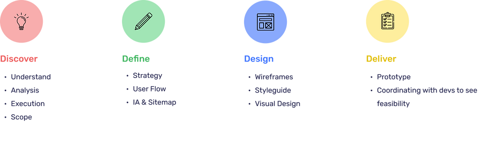
Design Process
.png)
Discovery
Stakeholder workshop
A 5-day workshop was conducted with the Joystik stakeholders, Product Manager, and Engineering Architect.
We explored the concept of helping patrons follow guided programs and services for better meditative and calming experiences through Joystik training.
The wireframes created by the client on a high level for the main features of the app helped us gather requirements for MVP.
Through stakeholder interviews, we got an understanding of the target audience and their pain points, which helped us in persona building.

Fig: Screenshot of feature discussions during the workshop using Miro
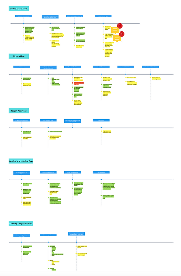
Refine Task Flows
We started defining a flow from client wireframes to understand the functionality of features
After a thorough understanding, we came up with a revised task flow with UX suggestions.
Existing wireframes and Task Flows


Proposed wireframes & Task Flows

User Journeys
After finalising task flow and validating with dev team, we can up with detailed user journeys which acted as a starting point for design phase.

Opportunity
Feature
Fig: Screenshot of user journeys using Miro
Wireframes
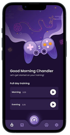
Dashboard
.png)
Power Meter

Visual Design

Mood Board
The Solution

Account Creation
Onboarding and Training

Power Meter and other Menu
Reusable Assets
Considering the scope of work for the next features created a reusable asset library for consistency of experience.


Usability Testing
Remote Moderated Testing
Method: Remote Moderated Testing, Remote
Age: Millennials and GenZ
Workflows: Onboarding, Profile Creation, Trainings, PSS Dashboard, Power Meter, Logout
Goals: Check Usability of the features mentioned above


Before the test
-
Users were sent out a form to fill out their preferred date and time slot
-
Based on responses they received a calendar invite from MS Teams
-
They were sent a link to download Testflight app, 5 min before the session started.
-
Recording of the session was started after taking consent from user
During the test
Pre-test
Shared test guidelines
Set context about the product and pre-test questions
Duration: 5 – 10 min
During testing task
Test document shared through email
Duration depended on the time taken by the user to complete the tasks
Post-test Questions
Feedback questions and discussions
Duration: 5 – 10 min
A survey was set out after the session, to gather tester’s afterthoughts
_edited.png)
Steven Dibb
Demographics:
Male
Millennial
User Behaviour:
Task 1 (Create Profile): Confident
Task 2 (Training Audio): Distracted
Task 3 (PSS Dashboard): Confident, confused at logout
Task 4 (Power Meter): Confused
Feedback:
The app looks good, but the training should have some keyword in their name about specific audio, which reminds them what it covers when they would like to listen to it again. Names like Day 1, Day 2, and Morning and Evening are not that intuitive
Tim Fischer
Demographics:
Male
Millennial
User Behaviour:
Task 1 (Create Profile) : Confident
Task 2 (Training Audio) : Focused
Task 3 (PSS Dashboard) : Confused
Task 4 (Power Meter) : Confident
Feedback:
He liked the flows, and the trainings could be a part of his daily routine. A few interactions like dashboard and logout felt less intuitive initially. He would look forward to a check-in for the goals selected in the onboarding and if there is any way to track their progress.

Tim Fischer
Demographics:
Female
GenZ
Meditation Instructor
User Behaviour:
Task 1 (Create Profile) : Energetic at beginning, focused after login
Task 2 (Training Audio) : Focused, playful and was expecting more from training sessions
Task 3 (PSS Dashboard) : Confused, Inquisitive
Task 4 (Power Meter) : Confident
Feedback:
She liked that it is a new concept but was seeking more information about it like how it could be used to the best of one's benefit. She also felt that gamification through streaks, reminders, push notifications would make it more intuitive to use. With a background of a meditation instructor, her focus was more on the product validation. For designs, she liked the dark theme and felt that it helps in reducing stress
Startup Screen
Feedback:
One of the users had feedback that the arrows / next button in the startup screen was not intuitive
There wasn’t a clear indication that the user is being redirected to login / sign up
Recommendations:
Arrow buttons can be changed to the button style followed in the account creation screen which would also make the design consistent
Priority: High
Design Efforts: Low

Power Meter
Feedback:
-
Users didn’t fully understand the power meter feature
-
Though the design was easy to use, the purpose of power meter was unclear to the users
Recommendations:
-
Power meter overlay text can be updated to something clearer and more upfront
-
A heading with a subtext followed by power up audio to improve visual hierarchy, which can make it easy to understand
Priority: High
Design Efforts: Medium
Trainings
Feedback:
-
Users did not understand how the training could be used to the best of their benefits
-
They felt that it is a new concept and difficult to understand for a first-time experience
Recommendations:
-
A more informative experience for a new user with the help of app walkthrough/overview
-
A clear indication of the benefits and how the training would impact their life positively
Priority: High
Design Efforts: High

Training Type
Feedback:
-
A common feedback was that the indication of parameters like sleep, focus, etc was missing as they were expecting that there might be some tracking about improvement towards their goals
-
Training named Day 1, Day 2, etc. felt redundant
Recommendations:
-
A library of training is categorized into different topics like sleep, focus, stress, performance, etc.
-
Training could be renamed into intuitive names that indicate what that specific audio covers
-
The dashboard could also indicate changes in sleep, focus, performance, etc
Priority: Medium
Design Efforts: High

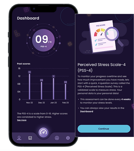
PSS4
Feedback:
-
Users did not fully understand how PSS-4 works and what it indicates
-
They were also not very clear about how often the survey comes up which generates the data on the dashboard
Recommendations:
-
Emphasis on information about PSS-4 to be increased
-
The flow needs to be changed, as the information shared in creating a user profile gets overlooked
Priority: Medium
Design Efforts: High
Suggestions
-
These points are a combination of direct suggestions from users and the ideas we collected by observing them. This would also improve the overall user experience of the product.
-
Create a connection with the user by humanizing the training, like some introduction about the narrator and selecting a narrator of their choice.
-
Clearer instructions that help the user in understanding the benefits of training, accompanied by video assets to explain tips/tricks (Maybe the helpful tips section could be in the form of a video).
-
A dedicated screen for specific audio has a seeker, a brief about that audio, and subtitles. A visual showing some relaxing vibrations/motion would also be nice to have.
-
A library of training where users can select the audio specific to the goal they would like to focus on.
Challenges
Technical
Users were facing difficulties in sharing their screen over Microsoft Teams. They also faced difficulty in casting their mobile screen on laptop. A possible reason could be lack of a Usability Testing tool.
User Availability
Since the app targets GenZ and Millennials and a major part of audience are female users, we had defined 5 usability testers, but due to their limited bandwidth, only 3 of them were available for testing.
Insights
-
Users liked the overall look and feel of the app.
-
The flows were easy to use
-
Two audios placed upfront on the home screen make it clear to the user about the training they need to focus on, leading to simplicity and ease of use
-
We discovered that the onboarding was easy and there were also some other suggestions that can improve the product experience, through the data received from the end survey